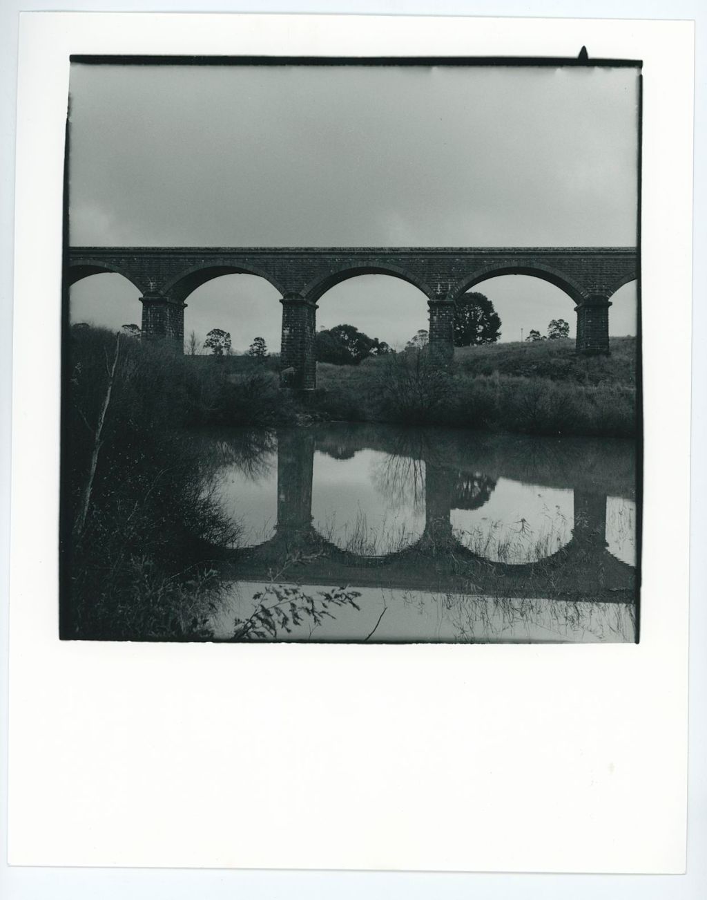
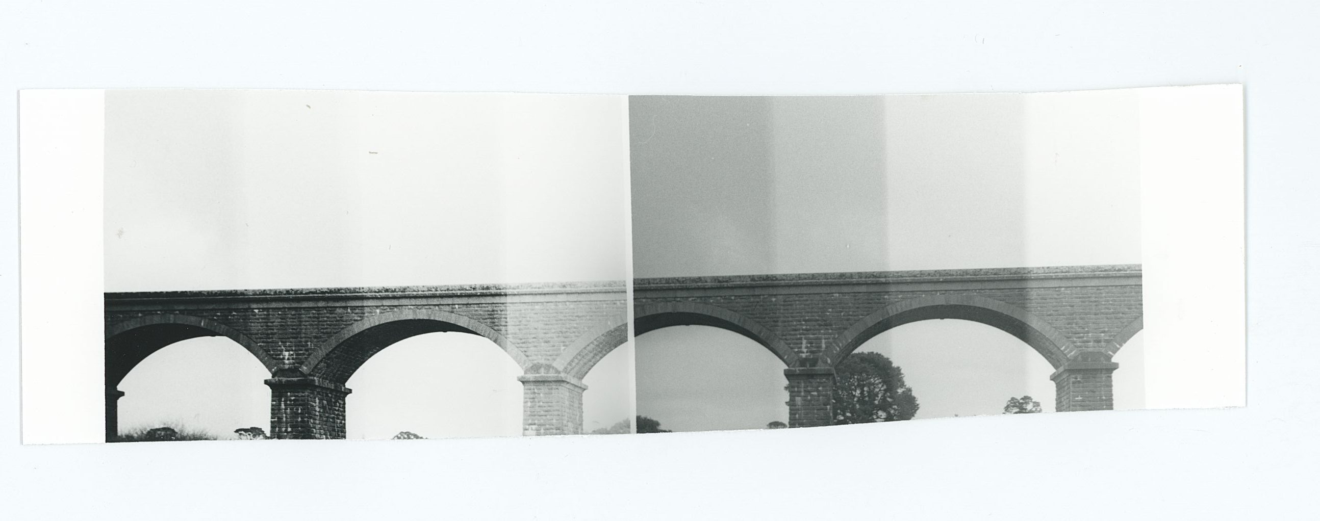
Whilst I showed you the bridge images from the first roll I shot through the Nettar, those were all scans.
For me a scan is lovely and all, but the proof is in the print. I take photos because I enjoy the darkroom and the final product., not necessarily the act of taking the photo.
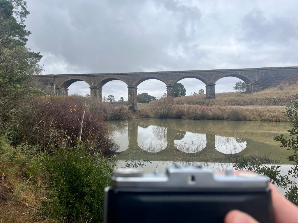
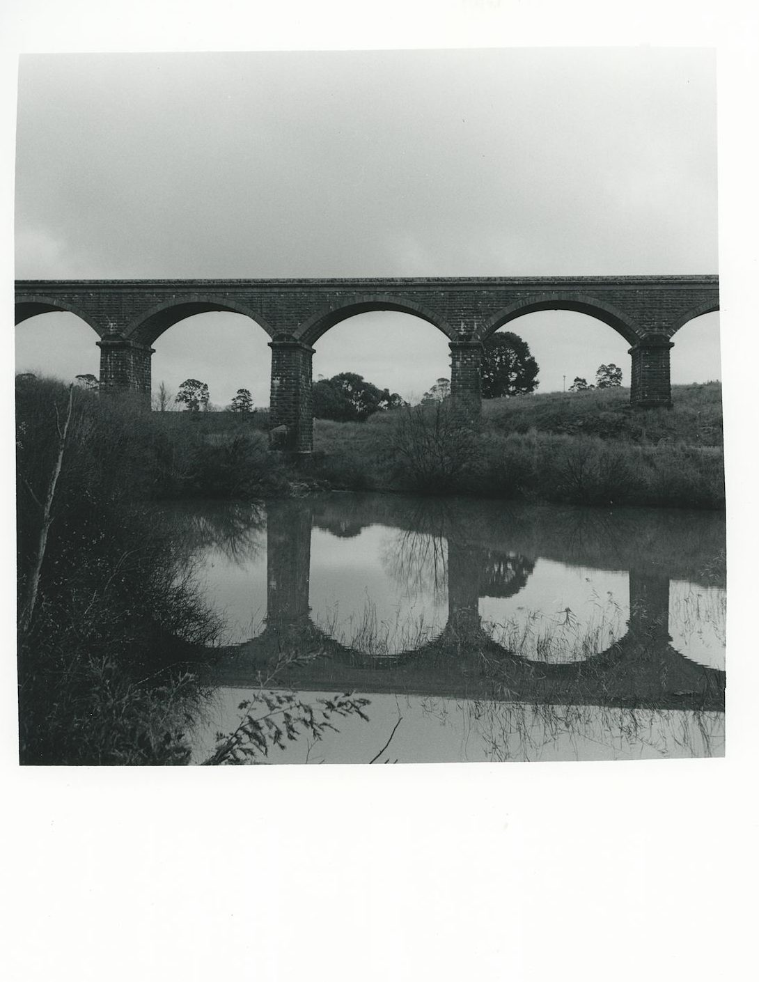
I knew I was going to attempt to either write about this, or at the very least try and learn something from the roll, therefore I also shot the above iPhone image as a reference.

I developed in D23r for almost 9 minutes. And I think this is where I went wrong. I can’t figure out if I should have developed for longer, to get the sky, or if I should have developed for shorter becuase there’s no cloud definition. I’m pretty sure shorter.
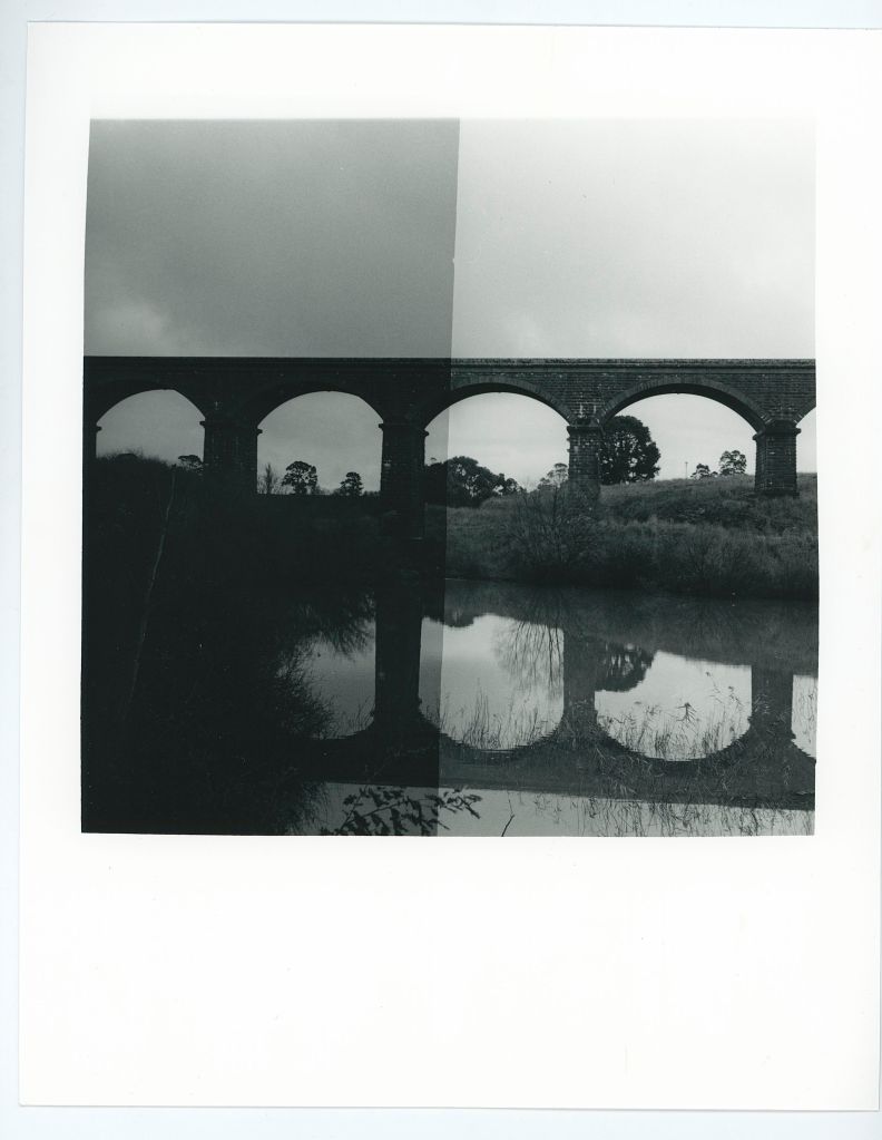
Be that as it may I scanned this is and got a nice looking image, albeit with a blown out sky.

Also I just noticed that the metadata from Lightroom is in the caption giving you all some useless information.
I was sure there was something in the sky. So I tried printing it in the Darkroom.
I use Ilford Multigrade Paper (8×10) in a pearl finish.
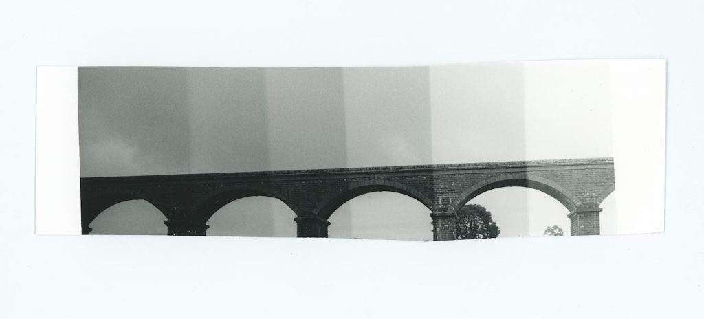
Here’s the contact sheet of the whole roll.
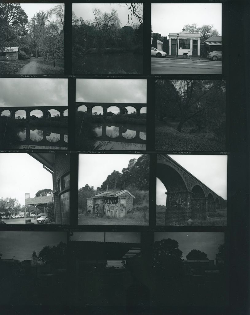
Looking at this contact sheet probably answers my question above. The development is probably fine but I over exposed the bridge. If I used my phone to get the reading then I stupidly had a +2 EV set on the exposure app (I just can’t remember what I did).
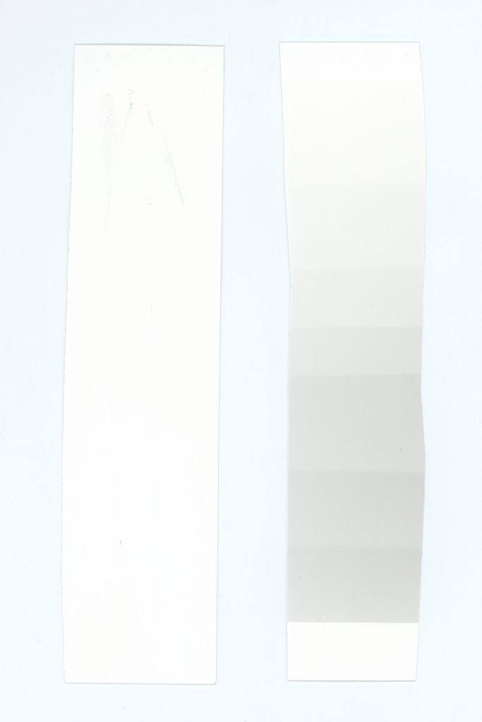
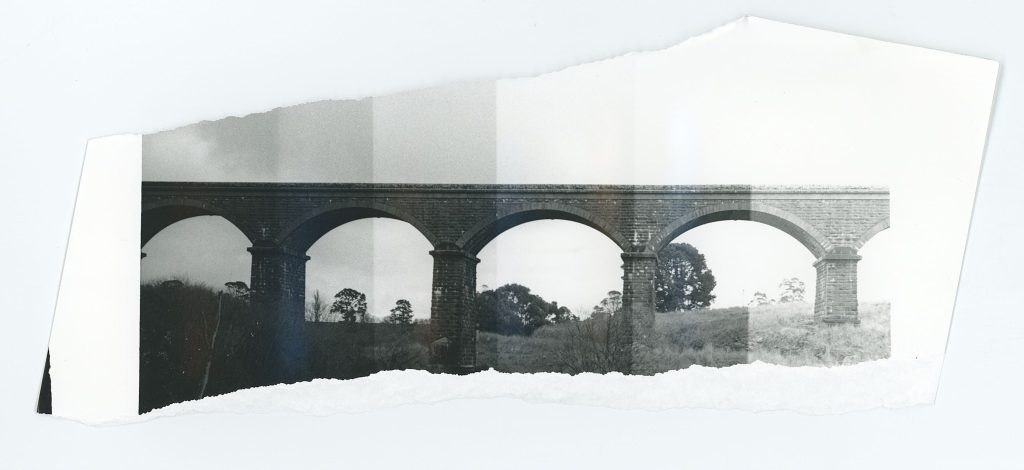
I won’t bore you with all my test strips but I will show a few. All you really need to know is that my initial test strips lead me to believe I needed to bring the tonal range of the sky more in line with the bridge or else I would just get a dark silhouette of a bridge on a moody sky. Like you can see in that contact print.
I therefore tried to flash my paper first. Previously I have made my own translucent Perspex flash thingy and ran some test strips at f/8. I haven’t actually used it, so I needed to first set up some pre flash test strips to determine the flashability (not a word). This told me that in order to get some density I needed to flash for about 12 seconds.
I next did a test strip of 3 seconds at grade 2 AFTER flashing the strip for 12 seconds and chose 9 seconds as this seemed to show the bridge nicely with some sky density.
Infact if you look at the next Test Strip, which is just a straight grade 2 set, you can clearly see the flashing helped to bring in the sky.
I started trying to get a straight print at grade 2. I therefore decided to print a full image with pre flash and grade 2 for 9 seconds.
I therefore decided to risk it for a biscuit and printed a full sized image on 8×10 with a pre flash, 9 seconds whole print and finally burn the sky in half a stop, or roughly 4 seconds. This should just affect the sky and leave the birdge alone.
I’m not convinced I can’t get better, and this is the part where trying different techniques might yield better/different results.
I went to split grade printing this. But again, the problem is the sky and the bridge.
Therefore, I tried split grade printing after the pre flash. The above test strip on the left is Grade 5 and on the right is Grade 0. The problem is the bridge can be clearly printed on both grades. I chose 6 seconds for grade 5, and 6 seconds for grade 0.
Final test strip complete I decided to do a proof print without any burning in to see if the sky would work.
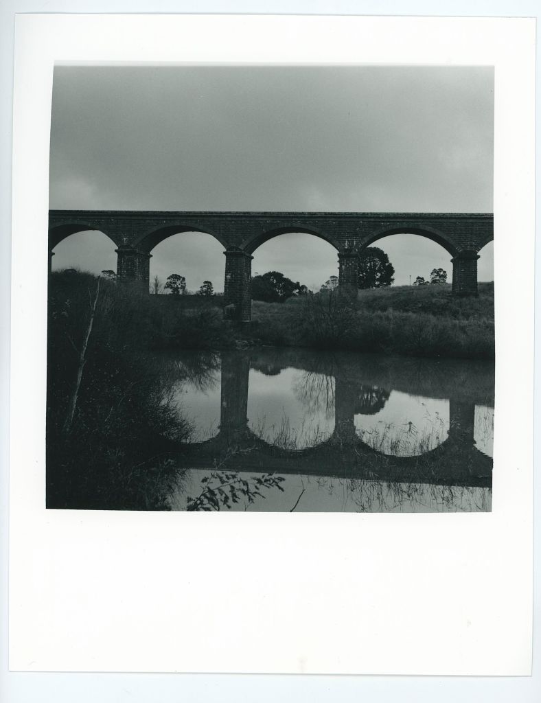
Lastly I decided I had wasted enough paper on proofs and to just go for it. Final decision was to split grade print this Gr0 6 seconds (with +0.5stop burn on the sky) and 6 Second Gr5. Plus my custom border.
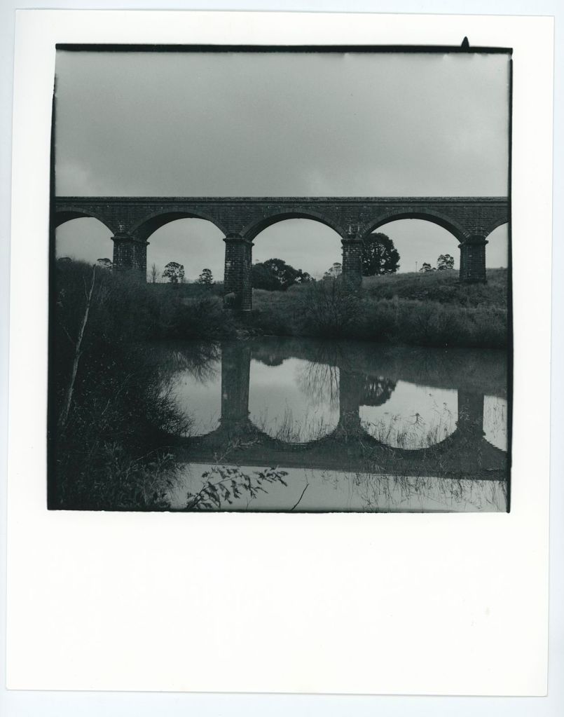
If you compare the negative scan to the print I’m definitely printing this darker than the scan, but then I’m also getting more sky than the scan could handle. I also think the tree in the left could be lifted slightly.
I don’t know…What do you think? Do you have any advice on how you would print this?

Leave a reply to Leanne Cole Cancel reply